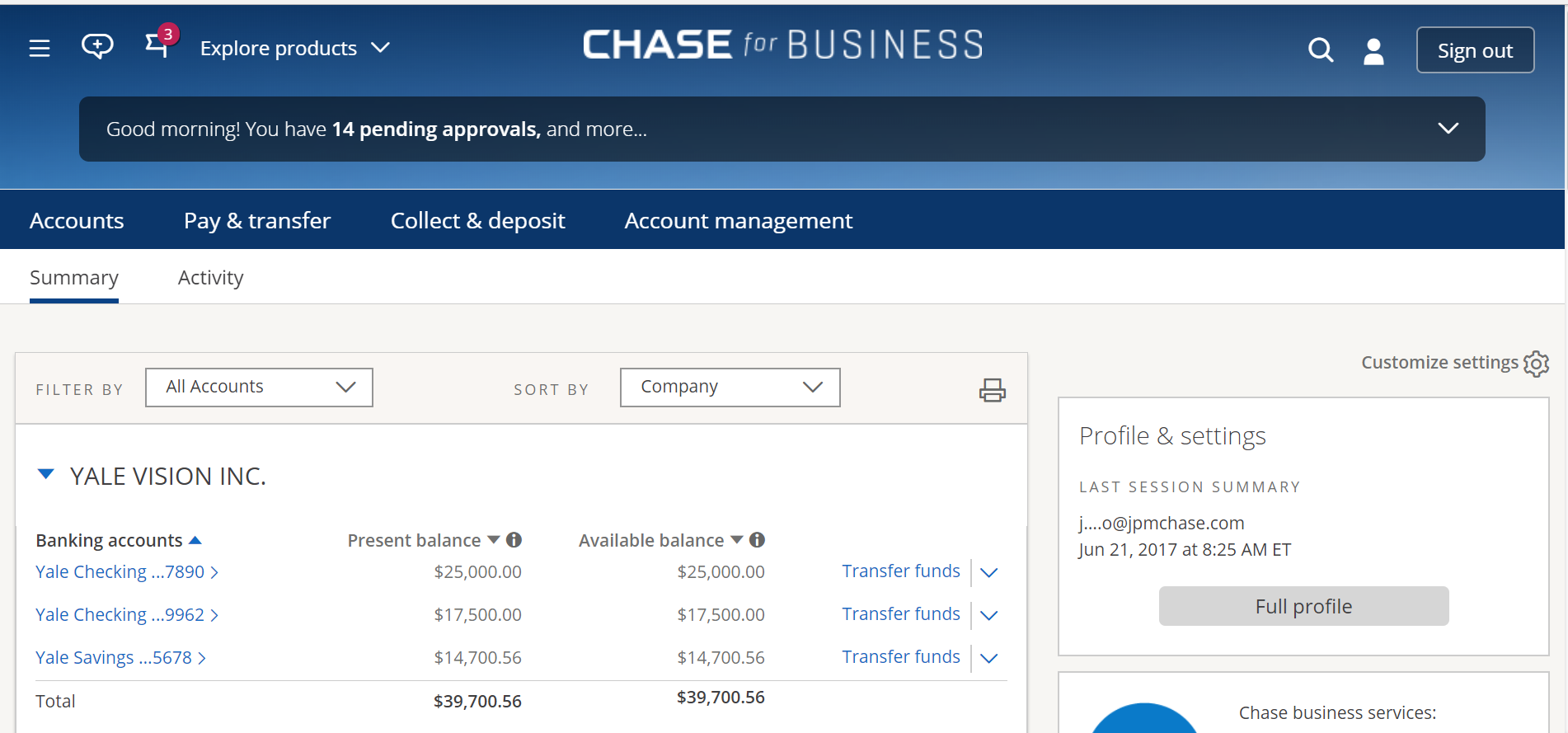
I complained when Amex ruined its perfect website by making ‘upgrades’. I complained when Chase’s personal website changed as well. The changes to Chase’s personal website did not affect me because I used Chase’s business account portal. The great days will soon be over. I received an email introducing the new chase.com for business.
Does this look familiar?


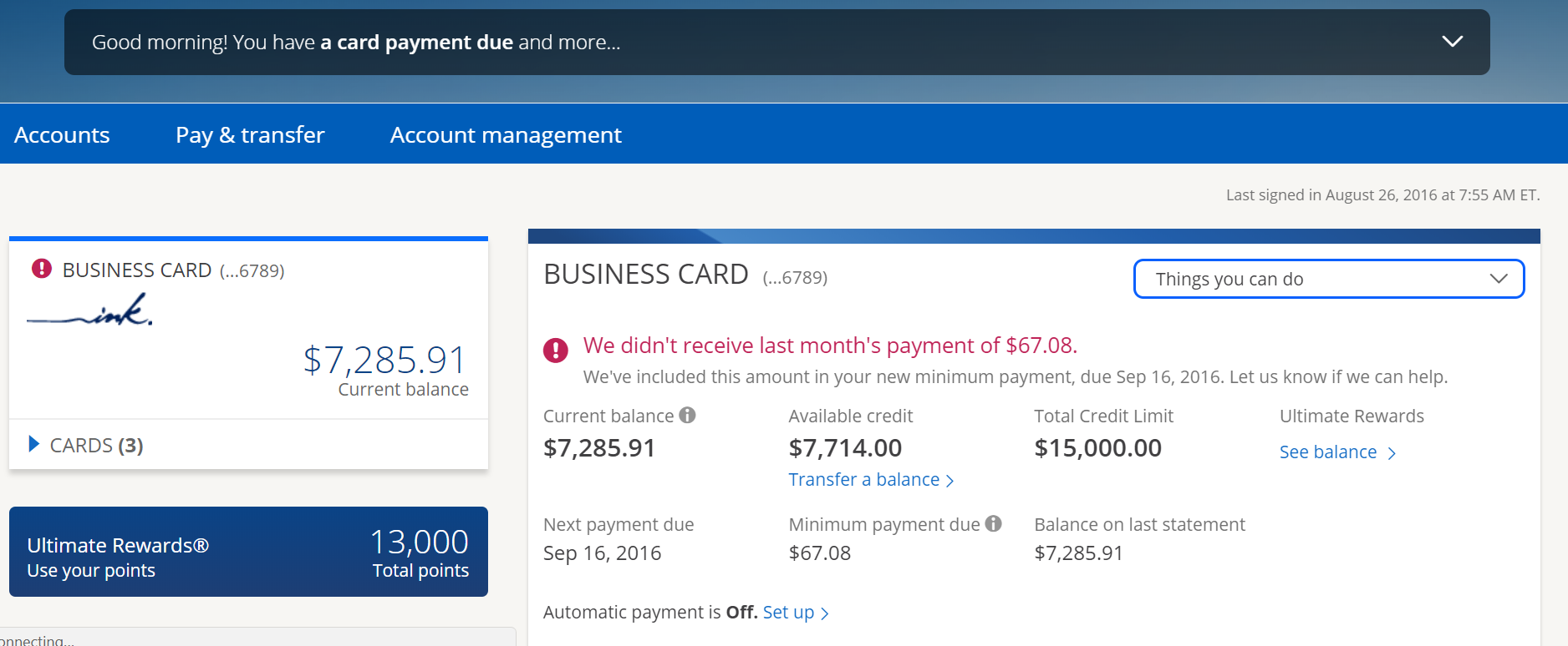
A few observations: Yale Vision is doing very well for itself in terms of its checking and savings. At the same time, it is curious that it is behind on its accounts payable. Finally, how does a business run up a 7k balance and only have 13k points?
Overall, this is not a welcomed change. Why Chase? Why?


Maybe Chase designed the site for real businesses with real online operating needs and not for bloggers that create multiple tax IDs to churn credit cards.
And you know what I do besides blog?
When will they allow exporting their end of year credit card transaction report in Excel. So frustrating at tax time.