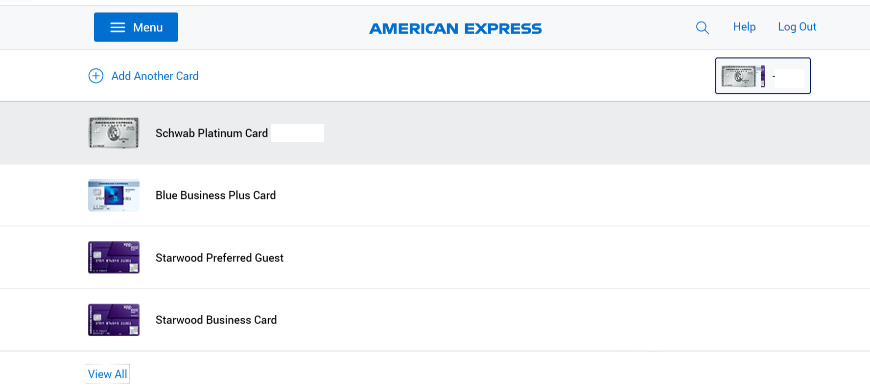
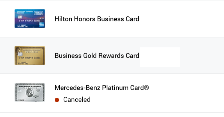
Why do banks keep changing their sites for the worse? Chase’s site is donwright terrible (see New Chase for Business Website: Disaster!). Earlier, Amex went through its own change, whereby a new page would open to show the balances for all of my cards instead of the nifty side panel (see Complaint Of The Week: Amex’s ‘New’ Website). Just as I was getting used to that, Amex made another change that is inexcusably awful. Let me show you by way of screenshot:

Now, when I click to see all of my accounts, it pulls up that menu without listing the current balance. Instead, I have to click on each account individually to see what I owe. An added annoyance is the “view all” button which hides my other cards.

(see Keep Vs. Cancel: Mercedes Amex Platinum (Year 2))
Seriously, what is the point of this change? Amex, your website has gone from bad to worse, and I can’t understand why.

Ha I thought I was the only one seeing this annoying scrunched up display. Agree why why why must they fix what isn’t broken.
Truly this one is awful